Usage Guide
Tips and tricks to using the Gamut Storybook as a user and developer.As a user
Search
The search bar is located at the top left of the page, right below the Gamut icon. It allows you to quickly find stories, components, and documentation. You can search by component name, story name, or relevant keywords.

Toolbar
On each page is a toolbar located on the top:
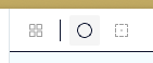
- Grid (the 2x2 collection of squares) - applies a grid to the preview
- Color mode selector (the circle icon) - toggles between light and dark mode for rendered code examples
- Outline (dotted square) - applies outlines to elements in the rendered code examples
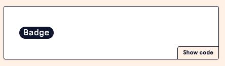
Showing code
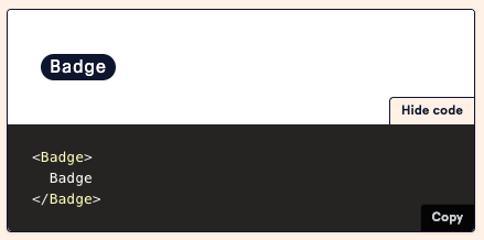
On the bottom right of each canvas (a rendered code example) is a button to show its code:
When clicked, it will show the code used to render the example:
If the code shown is obfuscated into a component that doesn't show the entirety of the code, it may be helpful to navigate to the Gamut repository to find the corresponding .stories.tsx file that contains the code for the example.
For instance, you might see a canvas that shows it's rendering <SuperCoolFillButtonExample />, but you want to know all the props that go into making this instance of the FillButton. In this case, you can navigate to the FillButton.stories.tsx file in the Gamut repository to see the code that renders this example. If you need further assistance, you can always reach out to the Gamut team via the Gamut slack channel.
Playground + Controls
At the bottom of a component story is a canvas that shows a robust example of how the component can be used. Connected to this canvas is a set of controls that allow you to change the props of the component in real-time. This is useful for testing different configurations of the component without needing to write any code.
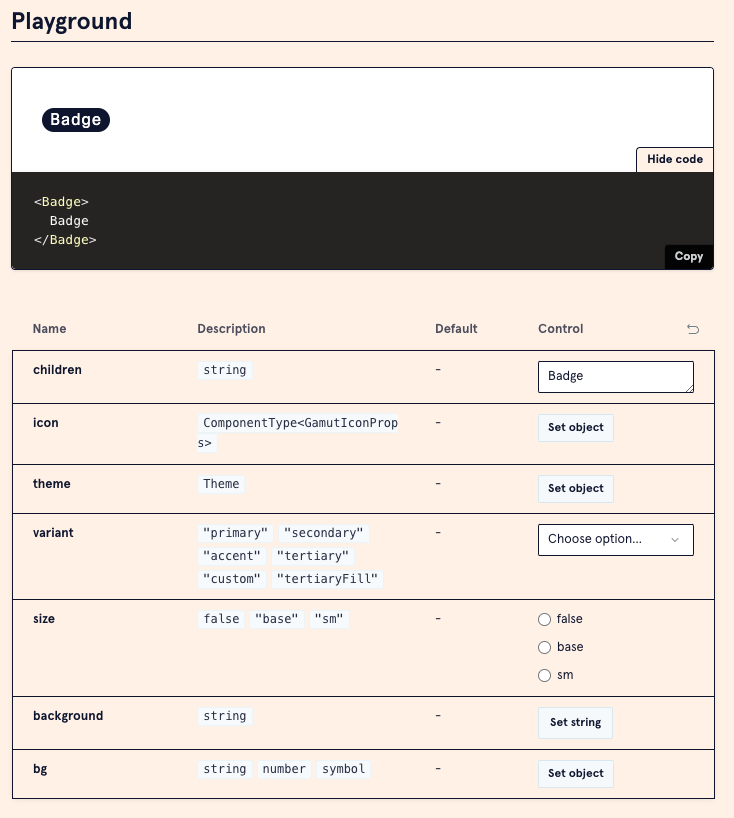
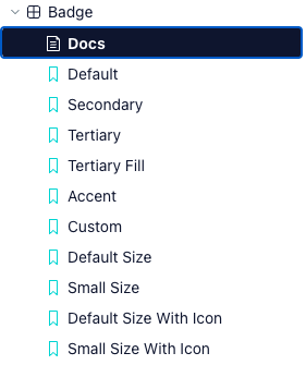
Individual canvas
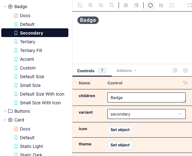
All canvases can be isolated by clicking on the link with the canvas's name in the side bar. For example, here are the canvases for the Badge component:
By default you'll be on the "Docs" tab, which shows the component's documentation. You can click on any of the options below it to see the individual canvases for that component. This will bring you to a sandbox where you'll have an expanded toolbars menu, the rendered component instance itself, and controls to manipulate the instance.
As a developer
Common errors
If you see an error in Storybook that says "Error fetching /index.json:" — it may be an actual error where the page is trying to render a story that does not exist.
Double check that the name of the story in the stories.tsx file matches the name of the canvas's of prop in the .mdx file.
If you've confirmed that the story names match up, you can try deleting the <Canvas of={...} /> line in the .mdx file and re-adding it. This will force Storybook to re-render the canvas and may resolve the issue.
Otherwise, you may need to restart your server to fix the issue.
When to yarn build
When making changes to /gamut-icons, /gamut-illustrations, or /gamut-patterns, you should run yarn build to ensure that your changes are reflected in the built output.
JSX in .mdx files
You can use JSX in .mdx files, but this is not recommended. If you need to include JSX, you should be adding it to the .stories.tsx file and then rendering inside a canvas in the .mdx file.
There are several reasons for this:
- Linting isn't as supported in the
.mdxfile, so you may not catch errors in your code, e.g. props might not be typed correctly - It can make the
.mdxfile harder to read and maintain - Storybook can find it difficult to parse, e.g. rogue whitespaces can cause the whole page to not render
Adding new stories
Follow the page to add new stories to the styleguide. This will ensure that your stories are properly formatted and follow the conventions used in the styleguide.
Exposing component code
When writing a story in the .stories.tsx file, you can export the component as a Story or a React component:
export const StoryExample: Story = { args: { ... }, } // OR export const StoryExample: Story = { args: { ... }, render: (args) => <ComponentName {...args} />, } // OR export const ComponentExample: React.FC = (args) => ( <ComponentName {...args} /> );
These exported components can then be used in the .mdx file to render the component in a canvas.
Each export type displays code differently in the "Show code" section of the canvas, so you can choose the one that best fits your needs.
When in doubt, ask!
If you're unsure about how to use a component or how to write a story, you can always reach out to the Gamut team via the Gamut slack channel (#gamut-team). There is a schedule rotating between Gamut team members who are on-call to help answer or triage questions.